

Judging books by their covers
A jaded designer’s shortlist of visual wins

As a graphic designer first and writer second, I have a lot of opinions about book covers — most of them negative.
I wrote an opening section about (what I think are) the most problematic literary design trends, which I originally intended to include in this newsletter. But for now, I’m omitting it. For one, it’s long. It’s also ranty. And really, do we need more negativity on the internet?
Here’s what remains: a collection of unique cover designs for recent and upcoming releases that are working, from both a design and marketing perspective. As always, art is subjective, and this commentary is purely the opinion of a somewhat jaded designer-slash-not-yet-published author. 😊
Ten covers that would make me pick up the book
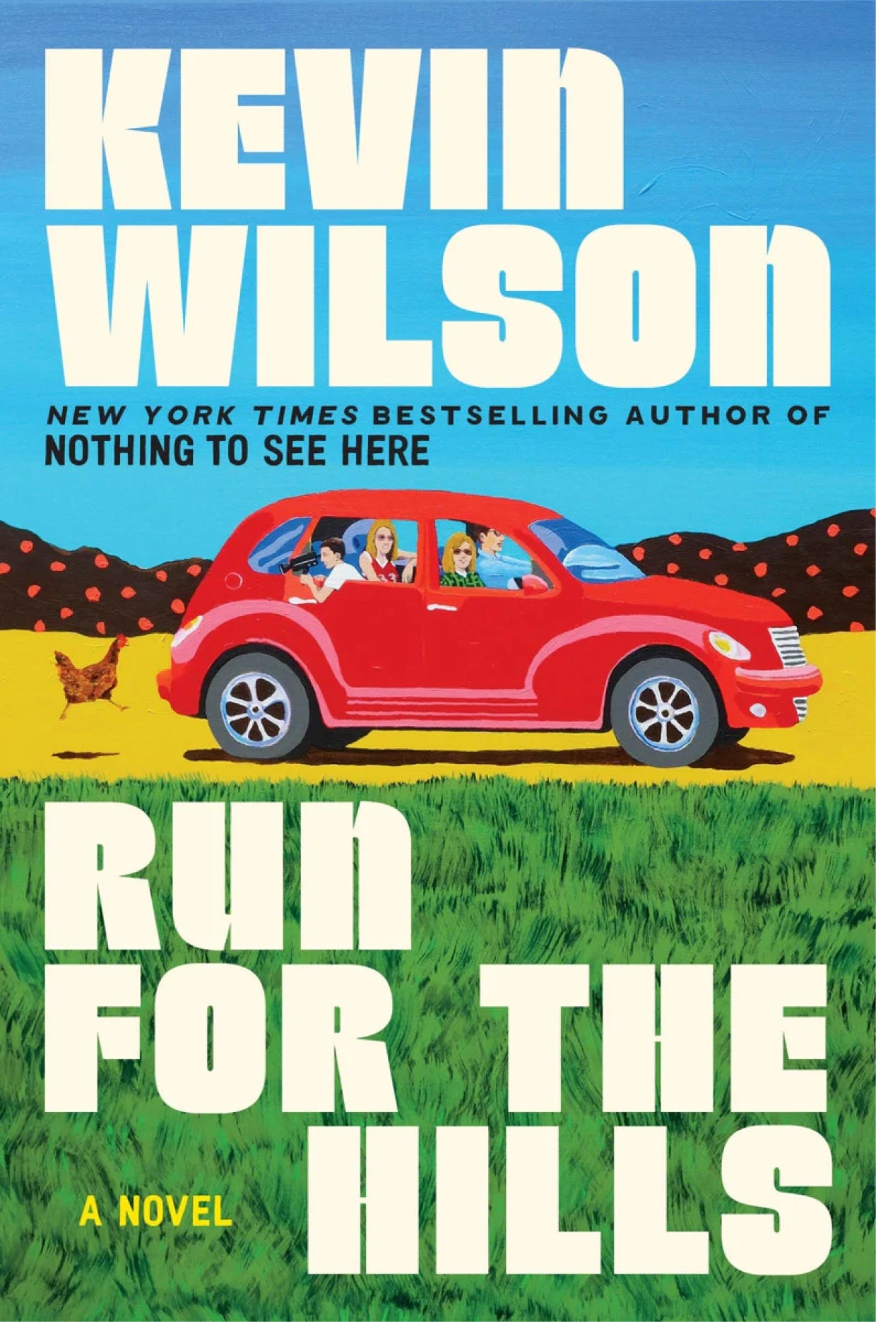
📚 Run for the Hills by Kevin Wilson
Genre: Literary Fiction
Logline: An unexpected road trip across America brings a family together, in this raucous and moving new novel from the bestselling author of Nothing to See Here.
🏆 What’s working: A great example of using illustration well. The red car is eye-catching, and facing right, implying forward movement. Combined with bands of primary colors, everything about this image promises fun adventures ahead. The layout is balanced, and the quirky but legible font adds personality.
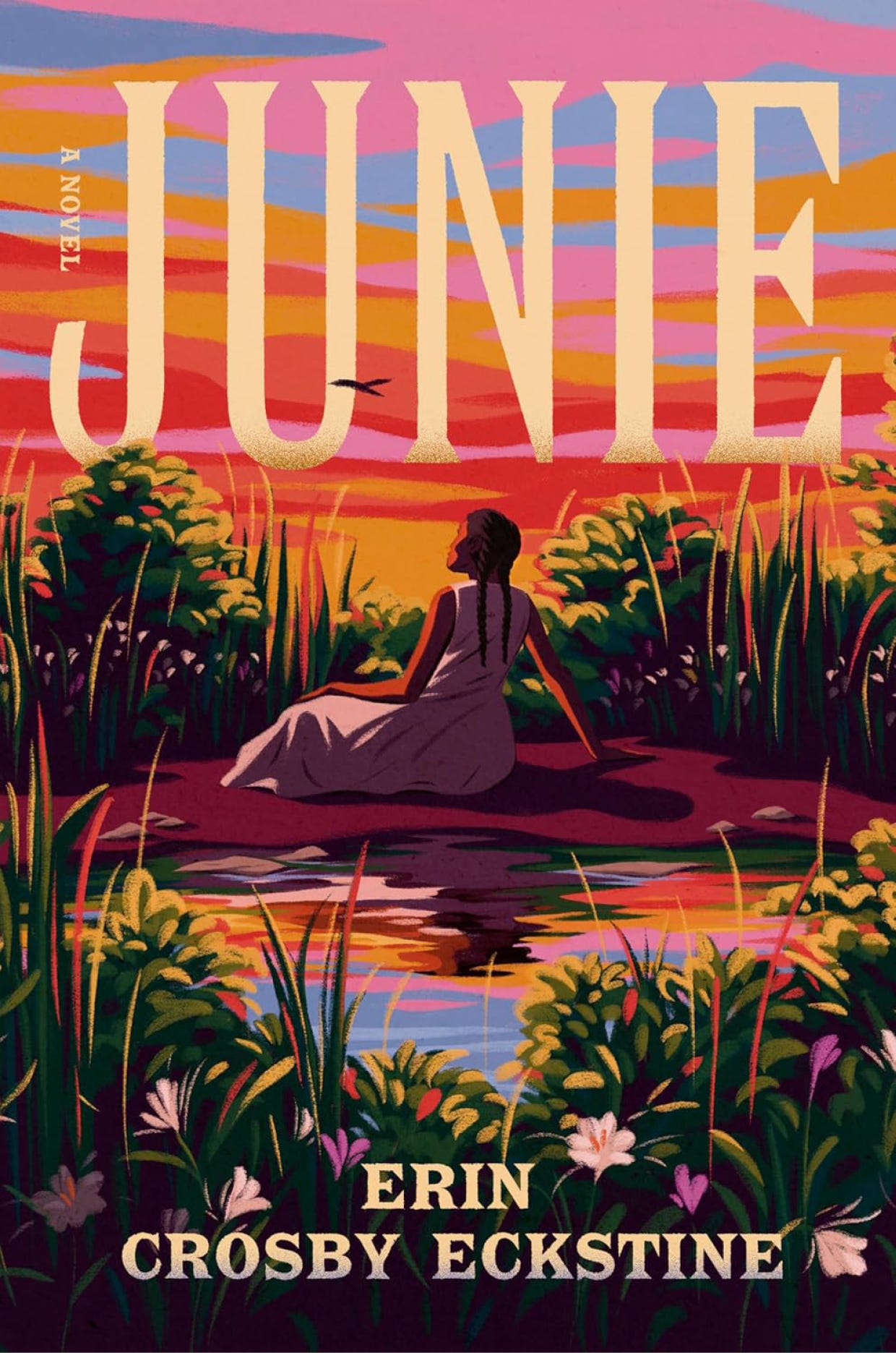
📚 Junie by Erin Crosby Eckstine
Genre: Coming-of-Age Fiction
Logline: A young girl must face a life-altering decision after awakening her sister’s ghost, navigating truths about love, friendship, and power as the Civil War looms.
🏆 What’s working: I am a sucker for a book that looks like a painting and this one couldn’t be lovelier. The color palette is rich and inviting, and the typography is bold but understated, so it’s not competing with the beauty of the image. And of course, a GMA Book Club sticker on the front never hurt anyone!

📚 Sunrise on the Reaping by Suzanne Collins
Genre: Dystopian Science Fiction
Logline: As the day dawns on the fiftieth annual Hunger Games, fear grips the districts of Panem. This year, in honor of the Quarter Quell, twice as many tributes will be taken from their homes.
🏆 What’s working: A book part of The Hunger Games universe has a tall order — it has to communicate its story and stay on brand. This cover does just that! We know what this is: it’s using fonts, styles, and tones we’ve seen on other Suzanne Collins titles. One of my biggest peeves is covers that look too much like other covers of books written by different authors. In this case, for a series, we want the books to have a common thread.
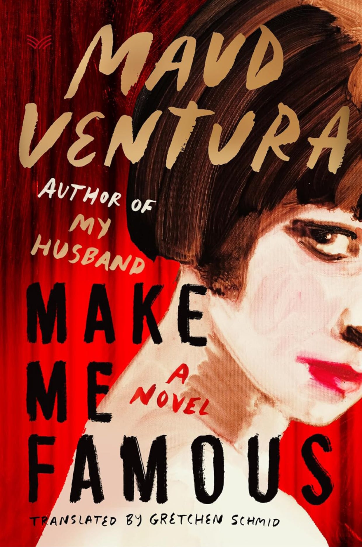
📚 Make Me Famous by Maud Ventura
Genre: Mystery
Logline: Daisy Jones and the Six meets Patricia Highsmith in this addictive, intense novel about the brutal and ferocious road to glory, from the award-winning author of My Husband.
🏆 What’s working: This book isn’t only gorgeous and intriguing through color and lettering that looks like it was written in lipstick — the thoughtful layout is begging you to open it and see what’s inside. The choice to have the female figure face towards the edge, with her face cut off, is absolutely intentional, prompting the reader to want to fill in the rest of the image. The only way to find out is to open the book! So brilliant.
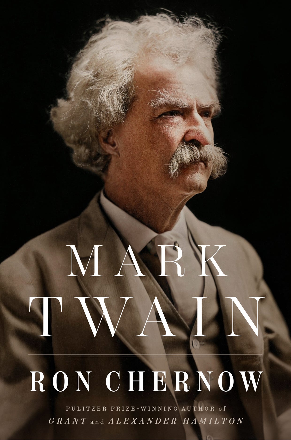
📚 Mark Twain by Ron Chernow
Genre: Biography
Logline: Pulitzer Prize-winning biographer Ron Chernow illuminates the full, fascinating, and complex life of the writer long celebrated as the father of American literature, Mark Twain.
🏆 What’s working: Minimalist perfection. The slightly tinted portrait pops against the black background, and the typography is clear, confident, and timeless. A masterclass in doing more with less.
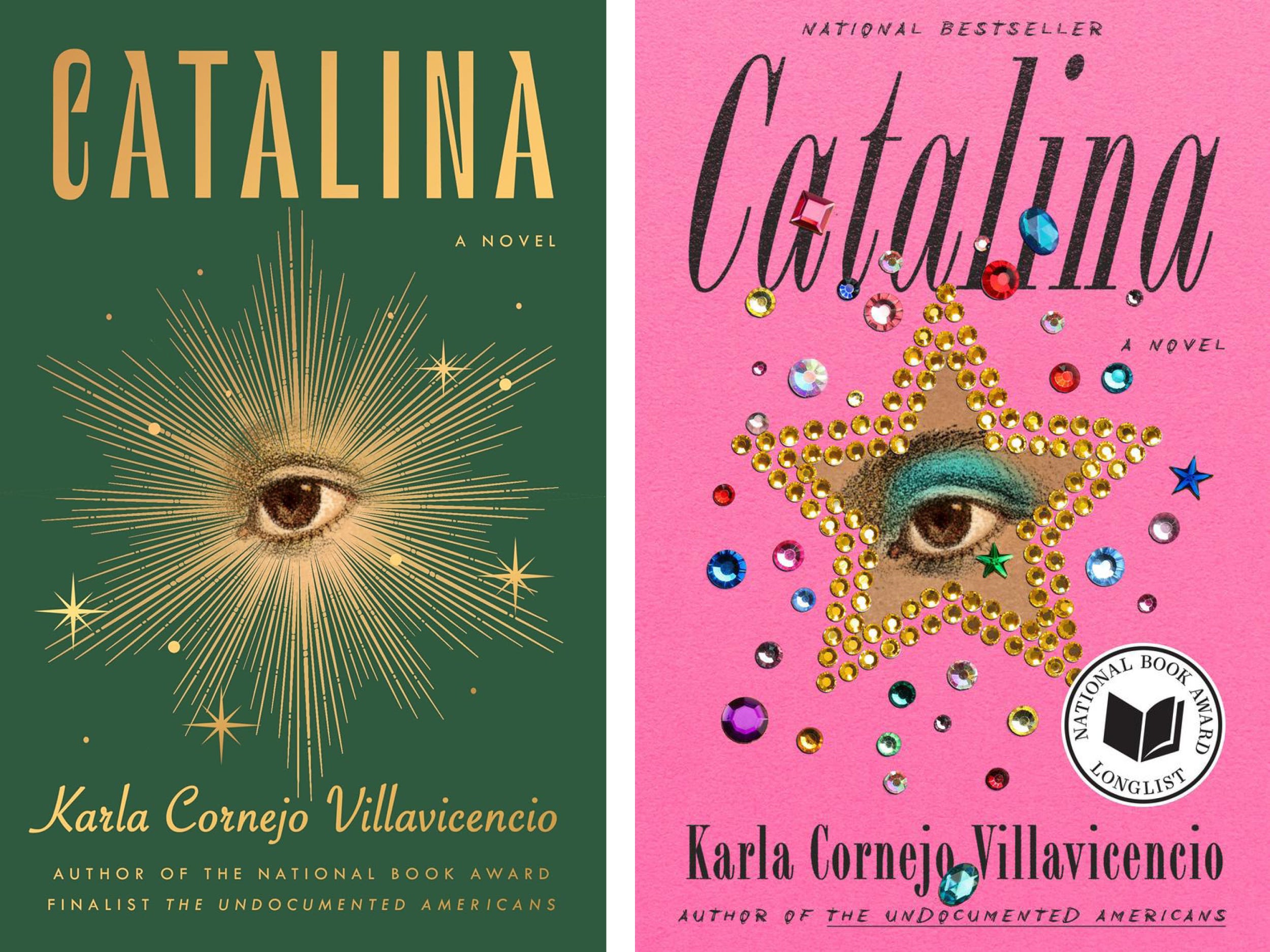
📚 Catalina by Karla Cornejo Villavicencio
Genre: Literary Fiction
Logline: A year in the life of the unforgettable Catalina Ituralde, a wickedly wry and heartbreakingly vulnerable student at an elite college, forced to navigate an opaque past, an uncertain future, tragedies on two continents, and the tantalizing possibilities of love and freedom.
🏆 What’s working: I found two versions of this cover, and both are winners! The burst around the eye on the green cover draws you in, creates interest, and enchants you with the surrounding sparkles. The pink version is eye-catching and unique. It looks more punk-rock than the mystical look on the original cover, but that only makes it all the more intriguing. The typography choices and placements are perfect — it all feels balanced and polished.
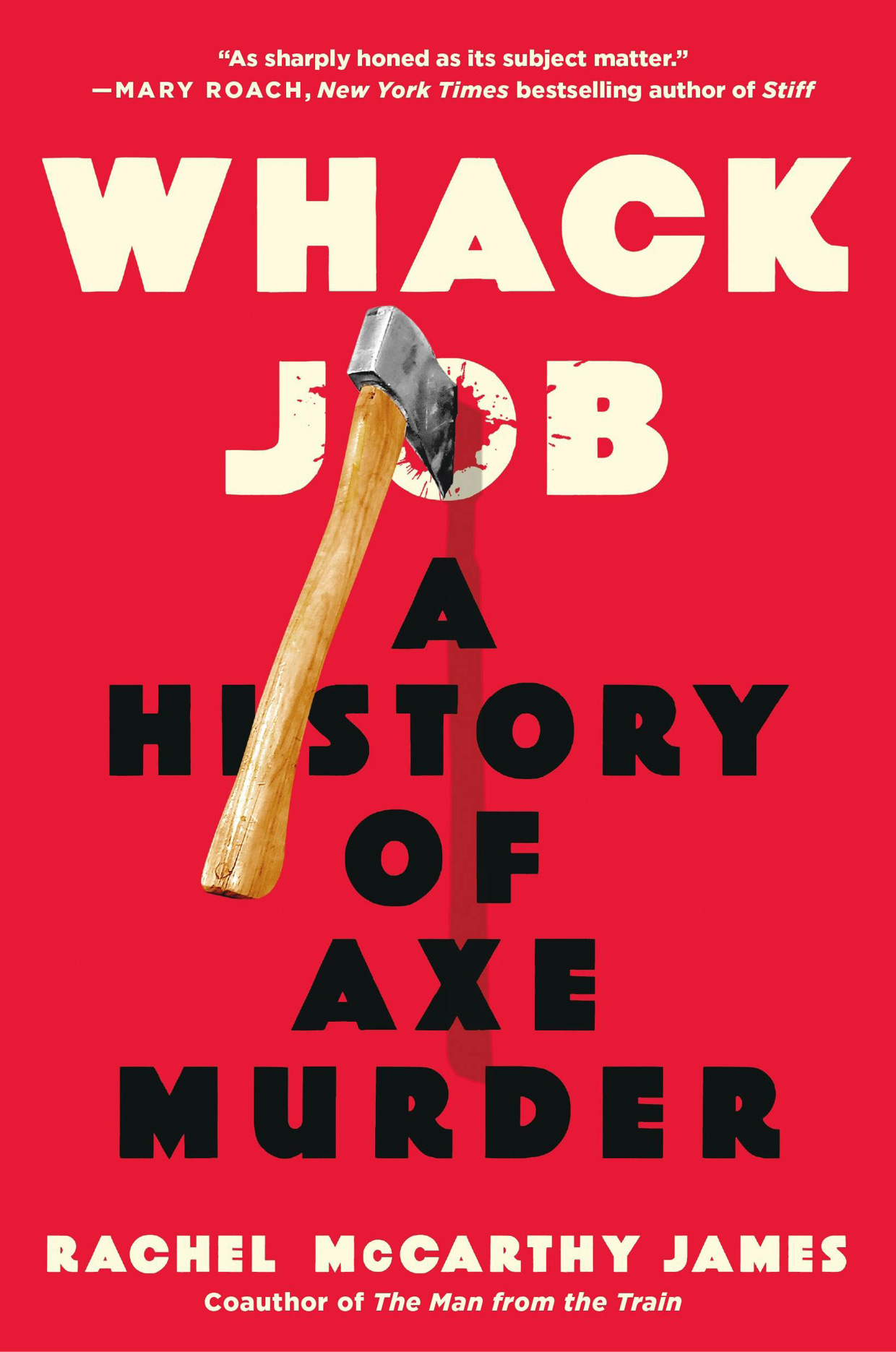
📚 Whack Job by Rachel McCarthy James
Genre: Historical, True Crime
Logline: A brilliant and bloody examination of the axe's foundational role in human history, from prehistoric violence, to war and executions, to newspaper headlines and popular culture.
🏆 What’s working: Like the Sunrise on the Reaping and Mark Twain covers, there’s no confusion here: we know exactly what this book is. The choice to use red is both eye-catching and appropriate for the subject matter. Like, Run for the Hills I love that the font is quirky and readable. The placement of the axe is brilliant, and the drip of blood is subtle and sophisticated. It would be impossible to walk by this book and not take notice.
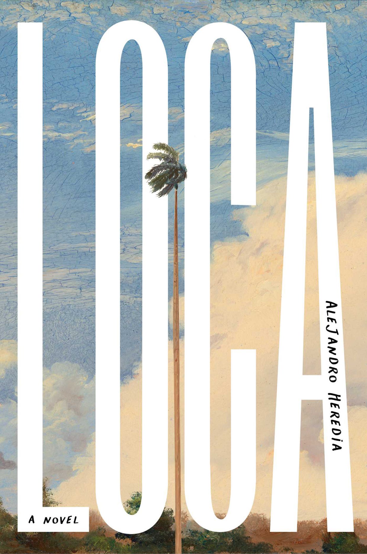
📚 Loca by Alejandro Heredia
Genre: Literary Fiction
Logline: From Lambda Literary Award–winning author Alejandro Heredia comes a spellbinding debut about intersectionality, enduring friendship, and found family set at the turn of the millennium in 1999, following two Afro-Caribbean friends as they journey beyond the confined expectations of their home country in the Dominican Republic and begin new lives in New York City.
🏆 What’s working: This title only has four letters, but nothing about this cover is small. It is sparse, but bold, intriguing, cool, and confident. This book is like your friend you want to be seen with because they make you look good just by knowing them. I fear that repeating is negating my point, but one three more times: less is more, less is more, less is more.
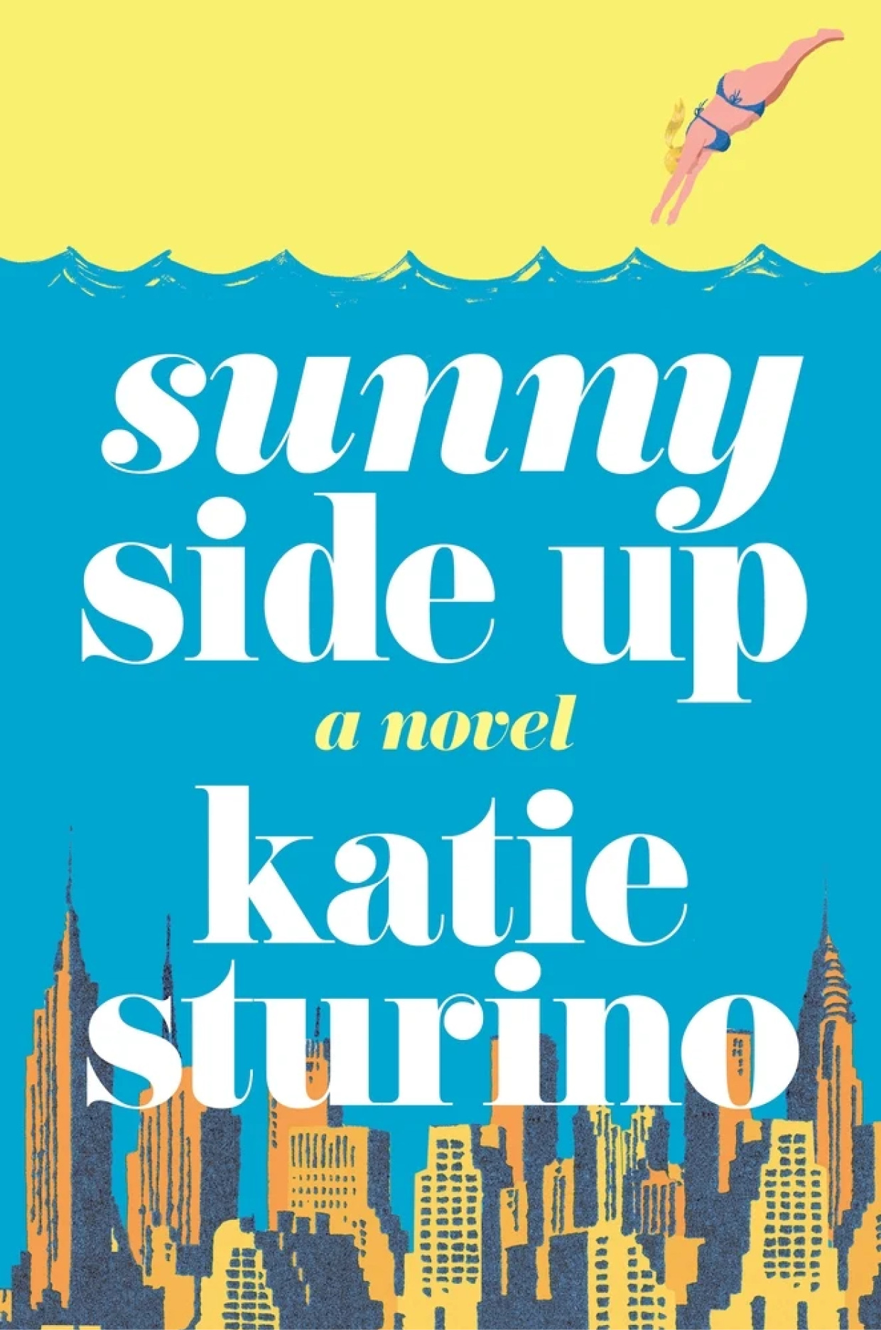
📚 Sunny Side Up by Katie Sturino
Genre: Romance
Logline: From body-acceptance advocate and MEGABABE founder
🏆 What’s working: Finally! A romance cover without a cringey illustration! I love friendly colors, the layout, the stylized cityscape, and the action of the figure diving into the water, getting me excited to dive into the story. This typography is giving perfect Sex and the City vibes, paying homage without copying.
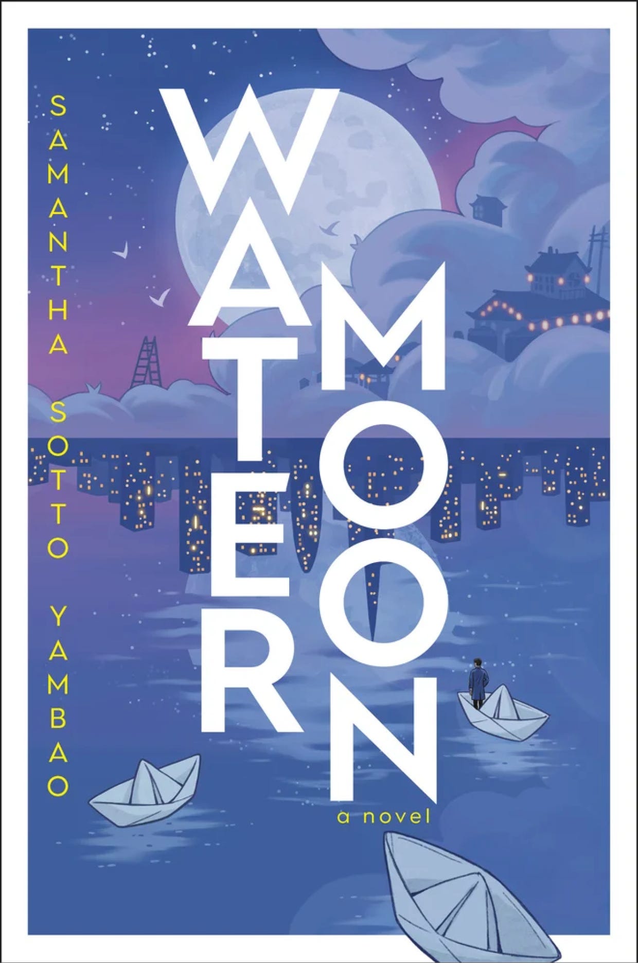
📚 Water Moon by Samantha Sotto Yambao
Genre: Fantasy
Logline: A woman inherits a pawnshop where you can sell your regrets, and then embarks on a magical journey when a charming young physicist wanders into the shop, in this dreamlike and enchanting fantasy novel.
🏆 What’s working: Cool tones that somehow feel warm. Hidden details that don’t overwhelm. It’s calming, intriguing, and unique — especially with that vertical nod to Japanese characters in the type treatment. Brilliant.
Closing thoughts
I couldn’t help but notice that most of these books have short titles. 🤔
Literary fiction seems to allow for the most originality in cover design.
I was annoyed to realize I couldn’t find cover design/artist credits anywhere online. Why is that?
We live in a world full of such talented writers and artists. How lucky are we?

✍️ Creative Exercises/Journal Prompts
Take yourself on a book cover treasure hunt at a bookstore or online. Which catches your eye? And why?
Recreate the cover of one of your favorite books in your unique style.
Treat yourself to a new book! Let yourself choose it based on the cover.
☀️ Five good things
When we can recognize the things that bring us the most joy, we invite more of them into our lives. Here are five things that made me happy this week. Share yours below!
Five good things that happened this week:
My husband suggested we take a silent disco walk to the beach (ABBA in our headphones), one of his best ideas ever. 💃🪩🕺🎶
It was a fun week behind the mic! Laura and I recorded another episode of our new season of Film to Table, and Steve and I created the promo for our upcoming show release. Both feeds have been dormant for a while, but we’ll share everything very soon!
We attended a student art gallery showcase and followed it up with a delicious brunch.
Speaking of lovely book covers, I started reading The Life Cycle of the Common Octopus by Emma Knight. I haven’t read enough for a full review, but so far it takes place in Scotland, and that’s enough to enchant me!
I am celebrating a small but significant win: a literary agent reached out, requesting to read my full manuscript! ✨🍾🤞
💬 Share your intention
Whether it’s a giant leap, a tiny to-do list item, a habit change, or something else, there is power in accountability, and this is a safe space to share your aim. Some weeks, we’ll fail, others we’ll soar, but with support, we’ll always keep going together.
Until next week, get out there and make something beautiful.
Michelle
🫶 Paid subscribers keep this newsletter going! If that’s you, thank you for being a part of this community.
✨ If this newsletter brings you value please consider becoming a paid subscriber. You’ll access to everything I share + a 12-month printable calendar download and my vision board toolkit when you sign up!
Here are some free ways you can help support this newsletter:
❤️ Like and comment on this post
📱 Take a screenshot and share it on social media
✍️ Restack a quote to share on Substack
💌 Forward to someone you think would love it
👋 If you received this from a friend, welcome! Here’s where you can subscribe.
⬇️ Use the link below to refer a friend!
Congratulations on the full manuscript request from the literary agent. 😮 A promising sign from the cosmos! ✨
I enjoyed your designer's shortlist of winning book covers, including the side benefit of being introduced to a stack of new-to-me titles. I put Water Moon on hold at my library. 🌕
Congrats of the full manuscript ask! that's huge! Hope you did something to celebrate!